One of my last trips prior to the pandemic took me to my company’s headquarters in Stockholm. On my way home, I managed to squeeze in a quick stopover in Helsinki. While there, I reached out to Stepan of Sarpaneva to see if I could swing by and visit his workshop. He was not only gracious enough to let me and a co-worker come visit, he dropped everything he was doing and entertained my questions for longer than we had any right to be there. While I had a couple of his more entry level SUF branded pieces, coming out of that conversation, I knew I needed one from the Sarpaneva brand. Fast forward a couple years, when the Nocturne came out, I knew that was the one for me!

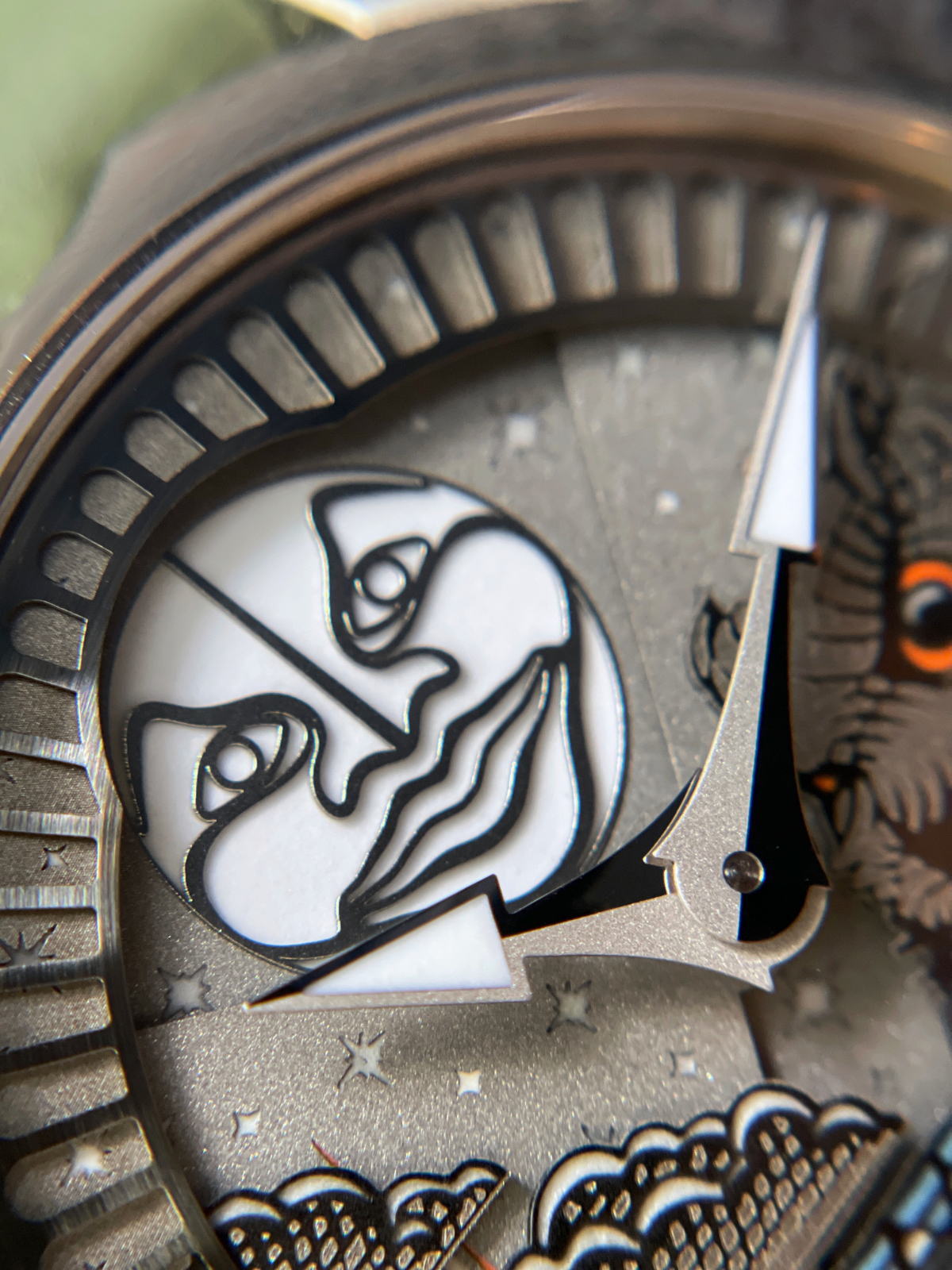
I had kicked myself when I missed the original Moomin watch drops, but turns out that things manage to work out. The Nocturne builds on the multilevel / multi-colored lume that the Moomin’s had, with the addition of a moon phase showing the signature Sarpaneva moon. The moon is stationary while a plate with stars and a comet on it move across the moon covering up or revealing more of it depending on the phase. This leads to a very straight edge that covers the edge of the moon, which I’m not crazy about but I get from an execution standpoint.
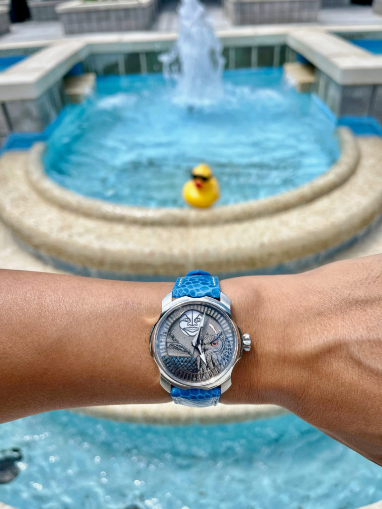
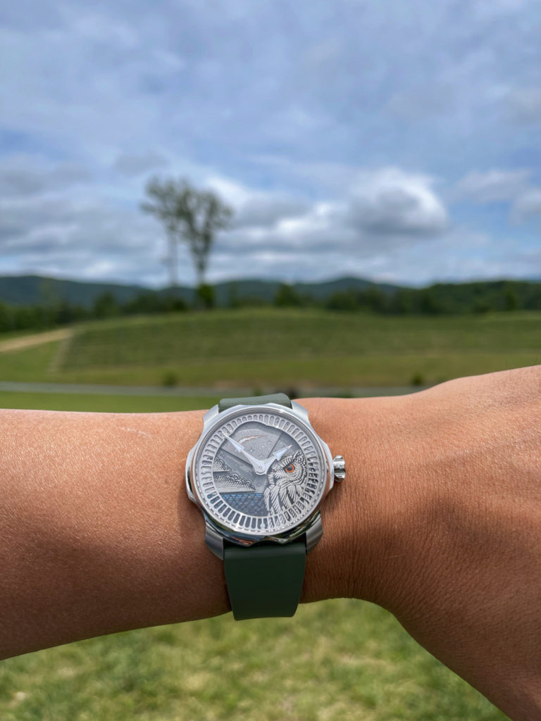
During the day, the dial has little bit of sparkle and appears fairly monochromatic with just a hint of color with the owl’s eyes. The hands are split down the middle to be frosted on one side and polished on the other which helps a lot with picking them out on the relatively monochromatic backdrop. I have the white moon which has lighter colored hands, but the harvest moon (orange moon variant) has darker hands which I think might actually look better. The outer ring’s cutouts are spaced to help with time telling, but also help provide a nice border for the dial. And the dial is the star of the show – especially at night. 8 different colors of lume highlight the clouds, sea, stars and comets making the picture come to life.
The case itself is what I consider signature Sarpaneva with the scalloped sides. It sits at 42mm, but with super short 46mm lugs, wears really well on my 6.75 inch wrist. While at first I was annoyed at the 22mm lugs (as I have very few 22mm straps), I think that’s the right call for this case given its size and sportiness. The crown carries that scalloped pattern in an aggressive manner that makes for easy grabbing when unscrewing to wind or set the time.

On the backside, there’s a skeletonized full rotor with another Sarpaneva moon face on it. That rotor covers up a lot of the rest of the movement, but given that it’s a modified Soprod A10, it might be for the best. Though the face does have some lume on the eyes and lips which if both fun and a little creepy looking.
Much like Sarpaneva’s motto of “Not for Everyone,” I definitely can see that in this piece – it’s whimsical and a little out there – but done in Sarpaneva’s unique design language. This being my first moon phase watch, I greatly appreciate the Nocturne having made me pay more attention to the lunar cycle. Though regardless of what phase the moon is in, it’s a pleasure to look at.

Leave a Reply
You must be logged in to post a comment.